


How would I build it with TailwindCSS #1 - Product card
build any kind of component easily, and responsively


I will be honest with you, I don't consider myself as a "CSS Sensei" or anything similar. Even though I have tried HTML & CSS years ago, it became more prominent in my life approximately 1.5 years ago. However, I have been working as a full-stack developer for the last 8 months, and thanks to the competitive environment around me, I think have improved myself in an efficient way.
I believe learning how to think the CSS way has helped me a lot throughout my daily workflow. Once you realize how to:
- group different parts of a component
- add spacing within children
- align the component,
building it responsively becomes easier.
In this post I will share my thoughts on how would I build a desired component. Since it's my css framework to go, I will use TailwindCSS to demonstrate my development process.
I believe that once the component layout is robust, it's faster to build, review and moderate the code. Plus it's fun!
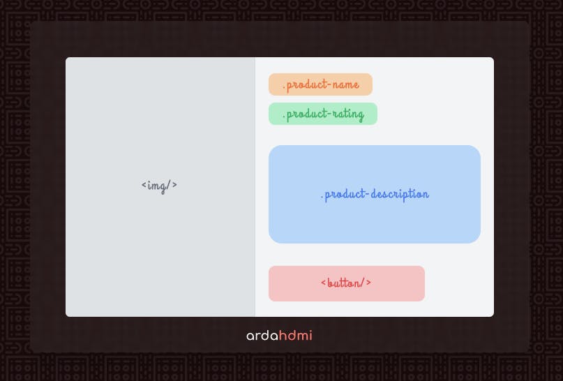
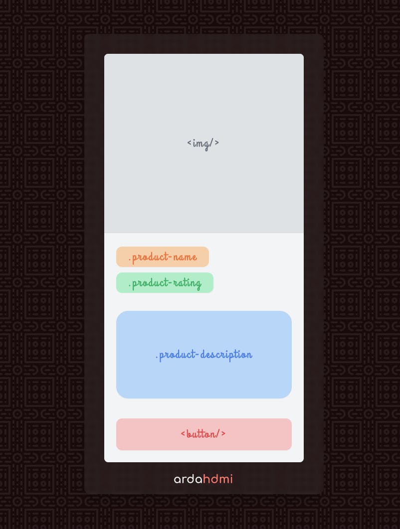
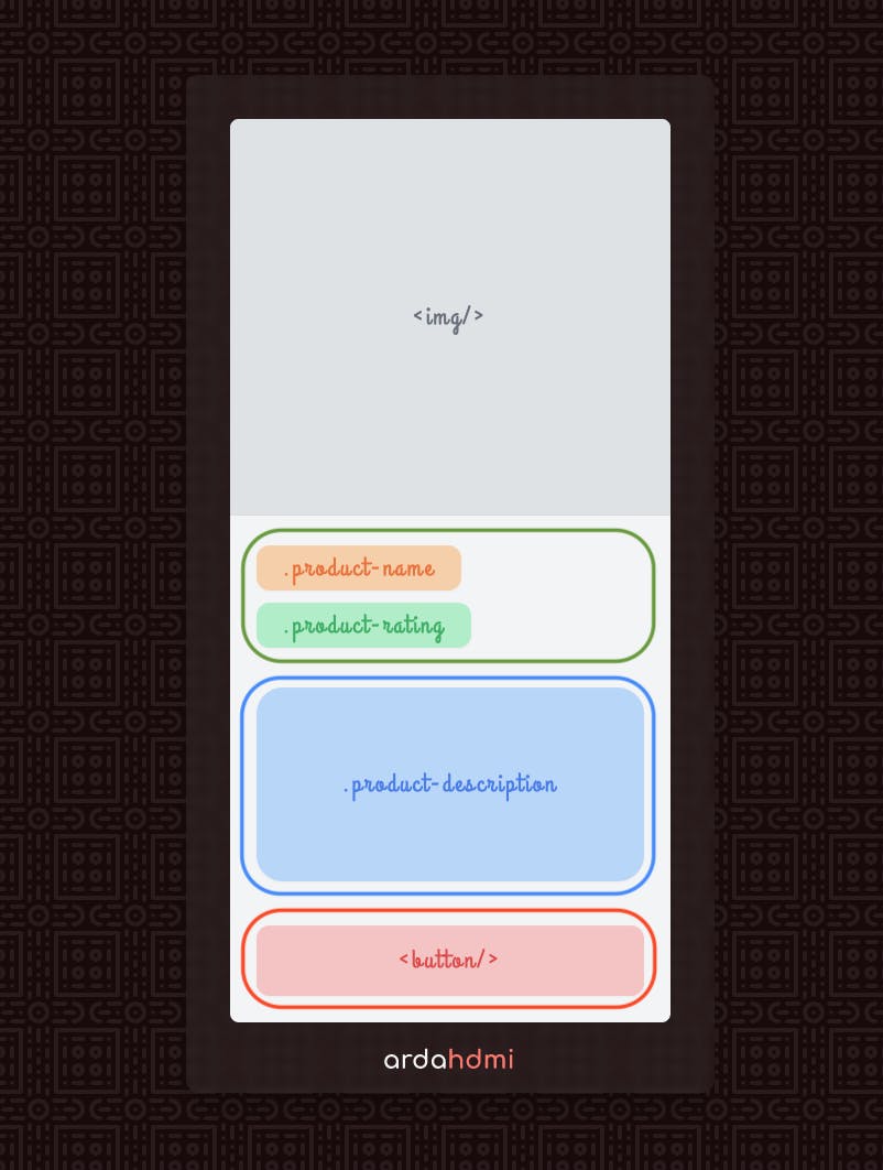
For the sake of the example, we'll look at the wireframe, that I also created with TailwindCSS. Here, you can see the desktop and mobile view of the component:
You can think of the names in the component and code as a representation. Here I focus only on the layout of the components, so I won't be explaining the child components. Depending on the response I might go into detail 🙂
Without further ado, let's begin:
Personally, I like using a top-down approach when I need to come up with the code piece that reflects the design. After working on an amount of projects, I think I learnt what "responsive design" means by understanding this approach in CSS.
Once the "outer shell" of the component is robust, we can get working with the inner parts of the component.
Let's first understand what we're facing with. When we check the design, 2 components stand out:
- responsive image with hidden overflow ( purple )
- component with text and button ( green )
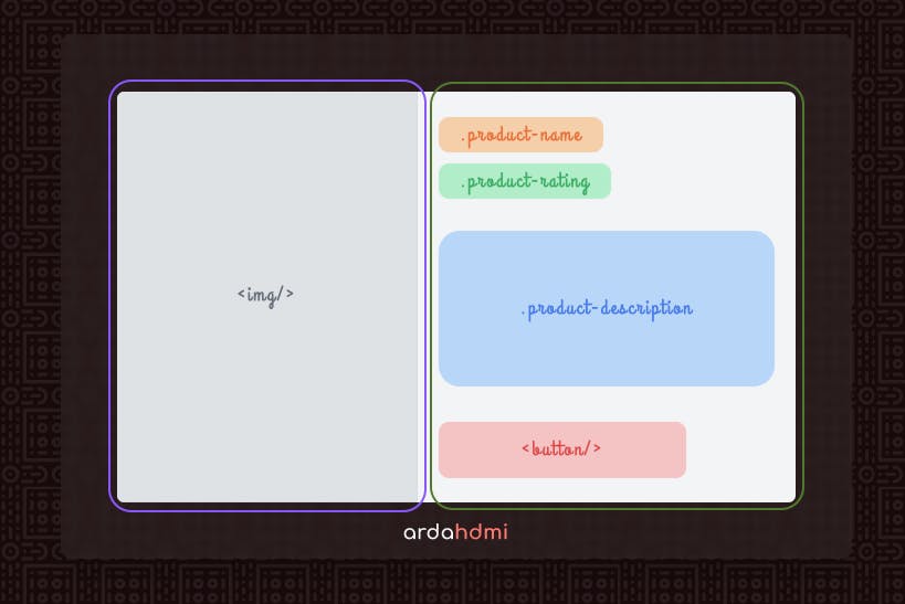
We now try to achieve the desired outcome for the outer component first. Then, we can safely continue with inner components.
Let's look at the alignment first. As you can see in the views, these components are stacked as:
- columns (flex-col) in base, small and medium view 📱
- rows (flex-row) in large and x-large view 💻
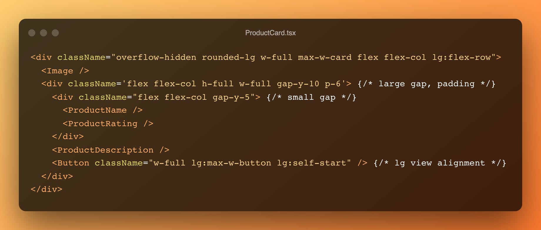
we can use flexbox properties to achieve this. We also need to change the overflow behavior to get rounded edges.
Taking mobile-first development into consideration, here's how it looks:
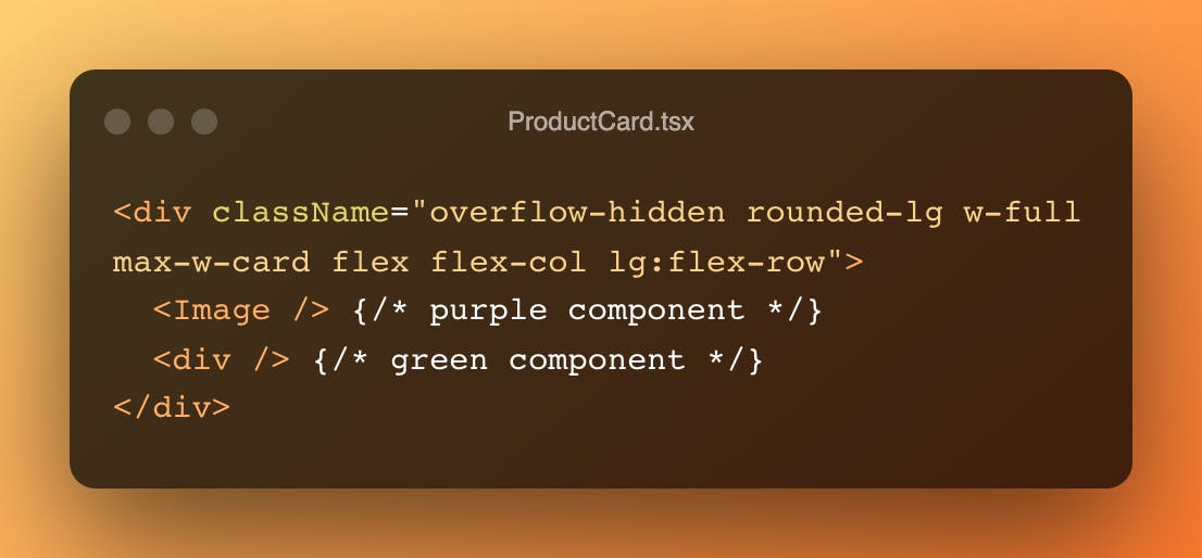
Note: max-w-card is a predefined max-width; property, you need to add your custom lengths to tailwind.config.js
Next, we will build the component with product information and call-to-action, or button in this case.
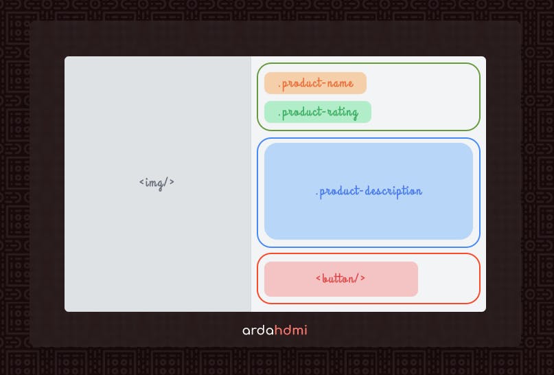
Notice that:
- product name and rating have smaller spacing, which is a sign to combine them together
- bigger spacing between name & rating | description | button define bigger components
- components are always stacked column-wise in each view
- button is full-width on mobile view and aligned left on desktop view
- there is a general pattern for padding
If we wrap the components as in the image, giving different spacing is easy.
Try to use a general spacing in parent instead of handling in child!
After arranging general padding within the wrapper, we need to use align-self after lg view to get the desired location for the button. Here is the result after this step:
And that's a wrap! I hope it will help you to think CSS way with TailwindCSS. Let me know what you think, feedback is well appreciated 😉 Thanks a lot for your time!